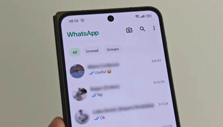
WhatsApp has once again made its mark by introducing a new design for both Android and iOS platforms. This latest redesign not only brings about changes to the visual aspects of the app but also bids farewell to some familiar color schemes that WhatsApp users have grown accustomed to. WhatsApp has a new design on Android for sake of users.
Gone are the days of the traditional layout with separate tabs for Communities, Chats, Updates, and Calls adorning the top of the screen? The new design has repositioned these tabs, now residing at the bottom of the screen, offering users easy access in a different sequence. Interestingly, the ‘Communities’ tab, once a primary feature, now takes on a central role, positioned third in line. This shift in placement prompts contemplation on the user experience – is this rearrangement more intuitive for users or a departure from established usage patterns?
One notable enhancement introduced by Meta in this redesign is the upgraded prominence of the search feature. Previously denoted by a modest magnifying glass icon in the top-right corner, users now encounter a conspicuous search bar beneath the WhatsApp name at the top. This alteration not only signifies a practical improvement in search functionality but also symbolizes a deliberate move towards streamlining user interactions. It is essential to note that while some users may have already experienced this change; its universal implementation may vary, showcasing the intricate nature of software updates.
A striking deviation from the past design is the absence of the distinctive green color scheme that once dominated WhatsApp’s interface. The previous bold displays of green at the top have been replaced, ushering in a more subtle approach. Despite this modification, green accents have not been entirely eradicated, preserving a semblance of continuity amidst the visual transformation. The removal of the prominent green hue may evoke mixed sentiments among users – some may appreciate the fresh aesthetic, while others may yearn for the familiarity of the older color scheme.
As with any design overhaul, the reception and adaptation to change remain pivotal factors in determining the success of the new interface. While some users may find the revamped design appealing and intuitive, others may harbour sentiments of nostalgia for the previous layout that catered to their preferences. Ultimately, the community’s response to this transformation will be a nuanced interplay of individual preferences, usability considerations, and the broader trend towards innovation in digital platforms.

