
Android Canary 2603 and 2604: What These Experimental Builds Are Telling Developers About the Next Android Era
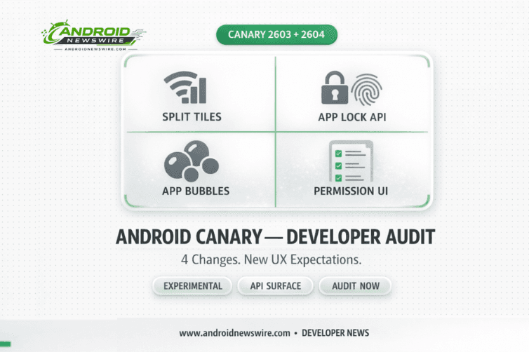
Two consecutive Android Canary builds – 2603 in March and 2604 in April – have arrived with a cluster of UI and system changes that, read together, outline a coherent new direction for Android’s interaction model. Separate Wi-Fi and mobile data Quick Settings tiles. Native app locking with biometric and PIN protection. Floating app bubbles for any app. A redesigned permission dialog UI. And in 2604, refined notification language and more compact long-press menus. None of these are guaranteed to reach stable Android. All of them are guaranteed to change how developers think about permissions, network state, overlays, and app visibility if even a portion makes it through to Android 17. This is the developer guide to both builds.
Understanding Canary Builds: What Signal They Actually Provide
The Android Canary channel is how Google tests upcoming operating system features specifically for developers who want to explore and test the newest Android APIs. The channel is unsuitable for everyday use, and features introduced in Canary may not always make it into a stable Android release.
That caveat matters. But the pattern across 2603 and 2604 is not noise – it is signal. These two builds are iterating on the same design directions: clearer per-service connectivity control, stronger app-layer privacy protection, more flexible multitasking primitives, and a visually richer, depth-aware system UI. Whether these exact implementations reach stable is less important than understanding the trajectory. Android’s UX expectations are moving in a specific direction, and developers who build against that direction now will have shorter adaptation cycles when stable changes land.
Canary 2603: The Four Changes That Matter
-
Separate Wi-Fi and Mobile Data Quick Settings Tiles
Until Android 11, Google offered separate switches for both Wi-Fi and mobile data. That later merged into a single Internet toggle, making it a two-step process to disable either. With Canary 2603, Google appears to be bringing back the simpler one-step controls – separate Quick Settings tiles for Wi-Fi and Mobile Data. If you have the current Internet Tile set, it becomes Wi-Fi, and you can manually add Mobile Data as a separate tile.
The developer impact here is indirect but real. Separate toggles mean users will independently and more frequently toggle each radio – which changes the frequency and pattern of connectivity state transitions that apps see. If your app listens for ConnectivityManager callbacks or uses NetworkCallback implementations to respond to Wi-Fi versus cellular transitions – adjusting sync behavior, content quality, or download settings – expect those code paths to be exercised more often. Test your app’s handling of rapid independent toggle sequences: Wi-Fi off while cellular active, cellular off while Wi-Fi active, both toggling in quick succession.
Android is also working on giving users more granular control over which networks apps can access – the split toggle is a stepping stone toward per-app network controls. Building clean, explicit network preference handling now positions your app well for whatever comes next.
-
Native App Lock API – A New Security Surface
App lock allows users to lock apps with a PIN, password, or fingerprint. When locked, notifications, widgets, and shortcuts are hidden. The feature is activated by long-pressing an app icon. This is a feature that Samsung, Xiaomi, OPPO, and virtually every major Android skin has offered for years. Its arrival in a Google-led Canary build strongly suggests it is finally heading to stock Android.
The developer implications run across three layers. First, the authentication model: App Lock integrates with the same BiometricManager and BiometricPrompt APIs that govern device unlock. Users can now enforce biometric verification at the app layer even without in-app biometric implementation. Your app’s internal security posture is no longer the only protection between device unlock and your app’s data.
Second, notification and widget visibility: when an app is locked, notifications, widgets, and shortcuts are hidden. If your app surfaces sensitive information in notification previews, lock screen widgets, or home screen widgets – banking details, health data, message previews – App Lock will suppress that content when the app is locked. Review your notification content and widget implementations against this assumption now.
Third, long-press menu hierarchy: to make space for the new App Lock and Bubble options, the long-press menu has been redesigned. If an application has two to four app shortcuts, they will be hidden inside a new “Shortcuts” submenu. App shortcuts are now nested rather than top-level. If you have designed user journeys that rely on shortcut discoverability from the home screen, that prominence has been reduced. Audit which shortcuts are truly essential and consider whether critical actions should be accessible through other surfaces.
-
App Bubbles for Any App – New Rendering Context
The app bubbles feature allows users to open apps in floating windows by long-pressing an app icon. These bubbles can be moved anywhere on the screen and expand into a floating window similar to picture-in-picture mode when tapped.
Previously, Android’s bubble system was limited to conversation-type notifications from messaging apps. Canary 2603 extends it to the entire home screen app layer. For developers, this introduces a new rendering context: the bubble window is small, fixed, and floating – different from standard phone layout, split-screen, or desktop windowing. It maps to a compact WindowSizeClass breakpoint.
Run your Compose UI and View-based layouts against the bubble rendering context. Apps that have not been tested in small windowed contexts may have layout issues – stretched interfaces, misplaced controls, or broken camera previews. If you are already testing for Android 17’s mandatory adaptive compliance (covered in detail in our companion article), add bubble window rendering to that test matrix. For large screens, note that there is a bubble bar on large screen devices that keeps all active bubbles organized – a new system UI element your tablet and foldable layouts need to account for.
-
System-Wide Blur and Redesigned Permission UI
Canary 2603 adds more blur effects to various parts of the system UI, including notification shade, Quick Settings panels, widget picker, and overlay menus. This is the “Liquid Glass” Material 3 Expressive direction – a pervasive frosted-glass aesthetic that represents Android’s most significant visual shift in several generations.
The permission request dialog – the sheet that appears when your app calls requestPermissions() – has been updated to match the new blur-forward aesthetic. If your app’s onboarding flow, permission rationale screens, or custom permission request UI is styled to match the current system dialog visual language, test how your custom UI appears adjacent to the new system dialogs in Canary 2603. Mismatched visual languages between your UI and the system UI create a fragmented user experience. Also note that screen recording review flow has been redesigned – apps that guide users through screen recording workflows need updated guidance.
Canary 2604: April’s Refinements
Google released Android Canary 2604 (build ZP11.260320.007) in April 2026, arriving earlier in the month than 2603. The build is available for Pixel 8 series and above, with images for older Pixel devices planned for release at a later date.
Canary 2604 introduces two notable UI refinements. The first is a notification shade update: once a user has cleared all notifications, the system now shows a “You’re all caught up” message rather than the previous “No notifications.” This humanizing language change is small but meaningful – it shifts the empty-state experience from a binary status report to a positive confirmation. For developers building notification-heavy apps, this is a reminder that the empty notification state is a designed experience, not an absence of design.
The second change refines the long-press app menu further. After users expand the “Shortcuts” section introduced in 2603, the actions menu is also now collapsed by default, accessible via an “Actions” toggle. The combined effect of 2603 and 2604’s long-press menu changes is a significant reduction in what is visible immediately on long-press: shortcuts require one expand tap, actions require another. The first-tap experience is now primarily App Lock and Bubble – the two new capabilities. For developers, this means that shortcuts which were previously a one-tap discovery from the home screen are now two taps away. Re-evaluate whether any shortcuts in your app should be promoted to more prominent access paths.
The Combined Developer Checklist
Before these changes reach stable Android – likely some version will appear in Android 17 beta – here is the concrete audit list:
Network handling: Review all ConnectivityManager and NetworkCallback implementations. Test rapid independent toggling of Wi-Fi and cellular. Verify your app handles the full range of connectivity state combinations correctly and without stale network state.
Notification content: Audit notification previews, lock screen widgets, and home screen widgets for sensitive data. Ensure your app degrades gracefully when widget and notification surfaces are suppressed by App Lock.
Bubble rendering: Test your app’s layout in a small floating window context. Add a compact WindowSizeClass test configuration to your adaptive UI test suite. Verify touch handling and overlay interactions when your app renders as a bubble alongside other apps.
Long-press shortcut visibility: Review your app’s shortcut implementation. Determine whether critical user journeys that relied on shortcut discoverability need alternative access paths given the two-level collapse introduced across 2603 and 2604.
Permission dialog UI: Test your app’s permission request flow against the Canary 2603 blur-based permission dialog. Review your custom permission rationale screens for visual consistency with the new system UI aesthetic.
Overlay interactions: If your app uses TYPE_APPLICATION_OVERLAY to display content above other apps, test how that overlay appears and behaves in the new blurred system UI context, and when another app is bubbled on top of or beneath your overlay.
The next signal to watch: Android 17 Beta 3, expected in April. What appears there is what will ship in the June stable release. These Canary features that are also appearing in beta are the ones that become compliance requirements – plan your testing and remediation timeline accordingly.
Related on Android News Wire: